Someone looking for your opening hours should not have to try six menu labels. If “Visit Us” has no hours, the address is tucked under “About,” and “Contact” disappears on mobile, a simple task becomes frustrating. Clear navigation helps people choose where to click and recognize when they have found the right page.
That matters for businesses selling appointments, services, products, or information. Visitors often enter through a page other than the homepage. They may need to compare options, check a policy, or speak to someone without first learning the company’s internal terminology.
Navigation is more than the menu at the top
The main menu is only one way people move through a website. The logo’s link home, links within pages, product categories, search, breadcrumbs on larger sites, and routes to contact or booking details all play a part. They should use consistent names. If the menu calls a service “Nutrition Consultations,” the destination page should not call it “Wellness Solutions” without explaining the connection.
You do not need to show every page at once. Visitors need to know where they are, what they can find, and where to go next. Someone reading a guide to paleo meal planning, for example, might want to know whether the business offers consultations, what those involve, and how to enquire. The menu can show the broad sections; a link in the guide can point to the relevant details.
What unclear navigation costs visitors
Confusing menus create small interruptions. A visitor interprets an unfamiliar label, opens a page, scans it, then goes back if it is wrong. On a phone, that may mean closing and reopening the menu each time. Some people keep looking; others leave or ask the business for an answer already on the site. Neither reaction necessarily means the offering was a poor fit.
For a health-related business, labels should also make educational material easy to distinguish from paid services. Readers should be able to find contact details and any limits on what a service provides. Clear navigation does not make website content personal medical advice. If you publish dietary guidance, remind readers to discuss persistent symptoms and significant dietary changes with a doctor rather than relying on the site alone.
Routine enquiries can offer clues: questions about published prices, service areas, or how to book may point to a navigation problem. They are not proof. The answer might instead be missing, outdated, or buried on the page.
Start with the tasks visitors came to complete
Owners often group pages around their teams: Operations, Programs, Resources, Partnerships. Visitors come with tasks. They want to see services, compare prices, find a location, check delivery or returns, or get in touch. Start there rather than copying the organizational chart.
Write down five to eight common reasons people visit. Look at customer questions, enquiry emails, on-site searches if you have them, and conversations with staff who answer the phone. Then ask whether a first-time visitor could spot a plausible route for each task, either from the main menu or from the page where they are likely to arrive.
- Finding an offering: Can someone see what the business provides without decoding a branded program name?
- Evaluating it: Are prices, eligibility, service areas, and practical details easy to reach from the relevant offering?
- Taking action: Is it clear how to book, request a quote, visit, or contact the team?
- Getting reassurance: Can visitors find policies, qualifications, and answers to common questions where they need them?
The priorities depend on the business. A neighborhood café needs obvious routes to its menu, hours, and location. A consultant may need services, approach, fees, and contact details. A shop with hundreds of products needs categories and filters as well as a top-level menu. Giving every internal page equal prominence helps none of them.
Choose labels people can predict
A label should tell visitors what they will find before they click. “Services” is usually easier to predict than an abstract brand phrase. If a page lists fees, “Prices” is clearer than “Your Investment.” Brand voice can come through in headings and page copy without making the menu a guessing game.
Broad labels may need a descriptive submenu. “Resources,” for instance, could hold guides, downloadable forms, case studies, and news. On the other hand, “Our Work” and “What We Do” sound so similar that visitors have to guess at the distinction. Consider naming one section “Services” and the other “Case Studies” if that is what they contain.
Keep the hierarchy shallow enough to understand
Group related pages without burying them. A small service business might use Services, About, FAQs, and Contact as its main menu. Individual offerings can sit under Services, with detailed answers on separate pages linked from the offering they explain. There is no ideal number of menu items for every site; the grouping needs to make sense to its visitors.
Dropdowns help when they present meaningful choices. They are less useful when someone must hover through several levels of similar options. “Individual Consultations” is easier to find under “Services” than under “Programs,” then “Support,” then “Personalized Options.” On a larger site, a category page can explain the choices before visitors go deeper.
Match page titles to menu labels. A click on “Delivery” should lead to a page clearly headed with delivery information. Breadcrumbs can show the route from a category to a specific page on a large site, but they cannot fix a confusing structure by themselves.
Make the mobile path equally clear
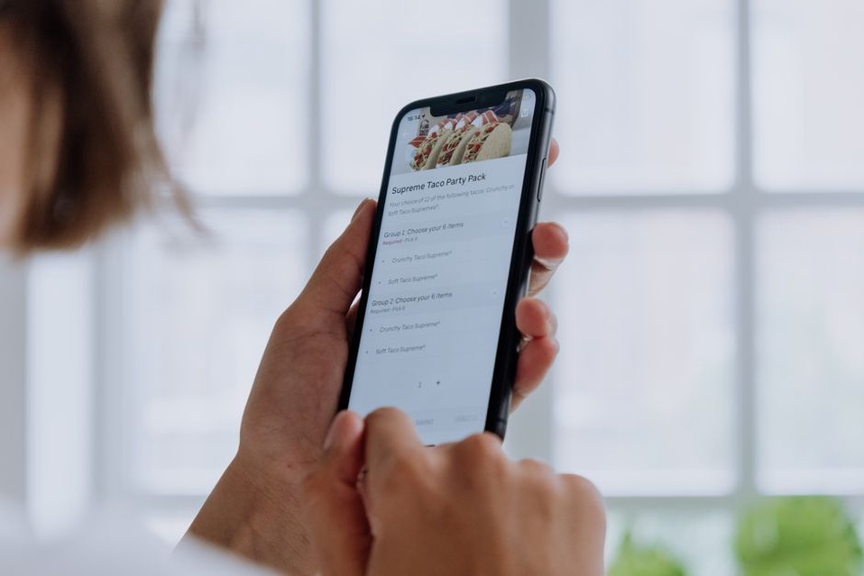
On a phone, a desktop menu may shrink to a single icon. Open it and check: Are labels readable? Is it obvious which items expand? Can you close it without losing your place? A menu that depends on mouse hover may not work by touch.
The desktop order may not be the best mobile order, either. Contact or booking options might belong near the top if people often visit on their phones for an address or number. Just make sure a persistent button does not cover content or interfere with the menu.
Navigation should work for different abilities and tools
Wording matters, but behavior matters too. Keyboard users need to reach menu items in a sensible order and see which item has focus. Links and buttons should behave as expected: a link goes to a page, while a button might open a submenu. When a submenu opens, its options must be reachable, and there should be a dependable way to close it.
Do not use color alone to indicate the current page or an expanded section. Check text contrast and make touch targets comfortable to use. These details affect whether someone can follow the route you have provided. A quick test with a keyboard and a phone can reveal problems that clicking on a large screen misses.
Search is helpful on content-heavy sites, particularly for visitors who know the product or topic they want. It should not be the only route to essential information. Search depends on the words a person enters; a well-labeled menu shows the main choices even when they do not know your terminology.
Connect pages without creating a maze
Not every useful link belongs in the main menu. A service description may need nearby links to fees, preparation details, or booking steps. A product page may need routes to shipping and returns. Put those links near the question they answer.
There is no need to repeat the same call to action in every paragraph. Place it where it fits, and say what happens next. “View appointment options” sets a different expectation from “Contact us.” If a button opens a form rather than completing a booking, make that clear.
The footer is a dependable place for contact details, policies, and less-used pages. It should not be the only place to find something visitors need early on. If customers keep asking about prices, moving “Pricing” out of the footer may help more than adding another promotional banner.
Check clarity with small, observable tests
You do not need an elaborate study to spot obvious problems. Ask a few people unfamiliar with the site to complete specific tasks without telling them which menu item to use. “Find the cost of an initial consultation” tells you more than “Have a look around.” Watch their first click, any backtracking, and the labels that give them pause. Resist explaining the menu while they try it.
Repeat the tasks on a phone, then compare what you saw with common enquiries and any site data you have. If people frequently search for a page already in the menu, its label may be unclear. A high exit rate on a page is less conclusive: visitors may simply have found what they needed. Use the data to decide what to investigate, not as a verdict.
Make changes one at a time where possible. Rename an ambiguous label, simplify a crowded submenu, or add a direct link from a relevant page. Check that the destination still matches its new label; changing several things together makes it harder to tell what helped.
For a first pass, ask someone new to your site to find your opening hours or the price of a core service on their phone. Note their first tap. If they choose a reasonable menu item but reach the wrong information, fix the label or destination before adding another option.