

Someone looking for help with persistent bloating should not have to search through three pages to find out whether a nutrition service offers medical care, coaching, or general education. Put that distinction beside the service description. It helps visitors decide whether the service fits their needs before they share personal information or book a call.
For a paleo-focused practice, a polished design is not enough. Visitors may be considering food restrictions while feeling unwell or unsure what to try next. They need accurate claims, clear limits, and an explanation of what happens after they get in touch. The same holds for other service websites where people make personal decisions, including those involving health or finances.
Make the service understandable before asking for contact details
At the top of each service page, answer three questions: What is offered? Who is it for? What will the client receive? “Personalized wellness support” tells a visitor little. “A 60-minute nutrition education session covering meal planning, food preferences, and questions to discuss with your clinician” is easier to assess.
Spell out what the session includes—and what it does not. If you review a food and symptom diary, explain whether the client fills it in beforehand and how you use it. If you do not provide diagnoses, laboratory testing, or treatment plans, say so. Someone considering an elimination diet should know up front whether help with reintroducing foods is included or requires another booking.
A short “good fit / not a fit” section can draw that line without dismissing anyone. Nutrition education may help someone organize meals; persistent, worsening, or unexplained symptoms need medical evaluation. Encourage visitors to discuss ongoing symptoms and substantial diet changes with a doctor. Dietary restriction is not a substitute for medical care.
Show the people and qualifications behind the service
Name the person who will do the work. An about page should explain their relevant training, any professional credentials, and the support they provide. Write out credentials in full and identify the jurisdiction if a title has different meanings in different places. If the service is education or coaching rather than licensed healthcare, make that easy to find.
A genuine photograph and a few words about working style can make an online service feel less anonymous, but neither replaces qualifications. Avoid badges or membership logos that visitors cannot interpret or verify. If several people deliver the service, introduce each one and say who handles appointments and follow-up questions.
Write claims that can withstand a closer look
Promises a provider cannot control undermine a service page. “End bloating in four weeks” suggests a certainty that the evidence—or an individual assessment—may not support. “Explore meal patterns and practical ways to plan food changes” describes the work without promising an outcome. Hold testimonials to the same standard as the rest of the copy: a dramatic quote can mislead even when the surrounding text is cautious.
For paleo or autoimmune protocol services, distinguish a dietary approach from a proven treatment. Research on diet, inflammation, the microbiome, and digestive symptoms has limits, and people respond differently. If you cite a study, say what it examined rather than treating an early finding as settled advice. A brief acknowledgment of uncertainty is more useful than a string of unsourced scientific claims.
Testimonials can show what it is like to work with someone, but they cannot predict another client’s results. Get permission before publishing a quote, disclose any editing, and do not share health details the client has not agreed to make public. A comment about clear communication or useful meal-planning tools may tell a prospective client more than an extraordinary health claim.
Remove the surprises from booking and payment
Show the price, session length, format, and currency where people decide whether to book. If the fee varies, give a realistic range or explain how you prepare a quote. Say whether follow-up messages, written notes, or materials are included. Visitors should not have to provide an email address to learn the basic cost.
Put policies in plain language
- Scheduling: Explain the available time zones, whether meetings are remote or in person, and when clients receive confirmation.
- Changes: State the cancellation or rescheduling window and any fee.
- Payment: Say when payment is due and what happens if you cannot provide the service.
- Contact: Offer a working way to ask questions before purchase and give a realistic response window.
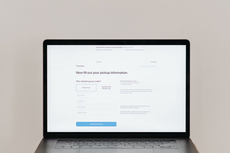
Keep these details near the booking button, not just in a long terms page. After someone clicks “Book a session,” the next screen should show the same service, duration, and price. An unexpected account-creation step or a different fee at checkout makes the offer harder to judge.
Handle sensitive information visibly and sparingly
A nutrition intake form may ask about symptoms, medications, and eating habits. Collect only what you need at that point. An initial contact form might need a name, email address, and brief reason for getting in touch; a detailed history can wait until there is a clear reason to request it.
Explain in ordinary language who can see submitted information, how it is used, and whom to contact about access or deletion. Link to a privacy policy from the form, and identify any third-party booking or video tool before visitors enter sensitive details. Use secure connections and keep software maintained, but do not treat a padlock icon as a full privacy explanation. Do not post identifiable client stories or diary excerpts without explicit permission.
Make the site easy to check, not just easy to admire
Visitors should be able to verify basic facts quickly. Keep the business name, contact details, service descriptions, and policies consistent across pages. Date time-sensitive resources or note when they were last reviewed. An old event notice or outdated fee can make people question more important information. Fix broken forms and remove offers that are no longer available.
Readable type, descriptive headings, meaningful button labels, and good contrast help people find answers on small screens and with assistive technology. These are practical trust features. If a contact button works on desktop but disappears behind a mobile menu, a visitor may have no easy way to ask a simple question.
Use incoming questions to spot gaps in a service page. If people keep asking whether a session includes a restrictive meal plan, answer beside the session details. If they ask whether online appointments are available where they live, clarify any location limits near the booking options. That helps more than calling the business “trusted.”
Check the path a cautious visitor would take
Open a service page without using the main menu. Can you find who provides the service, its limits, and its price, then ask a question or book? Repeat the check on a phone. None of those steps should depend on tiny text, a hidden policy, or an unclear button. Ask someone unfamiliar with the business to describe what they think they would receive, then compare their answer with the actual offer.
One edit may clear up several doubts. A vague “Gut health consultation” card, for example, could instead read: “45-minute online nutrition education session; $90; includes a written meal-planning worksheet; does not diagnose or treat digestive conditions.” Add the applicable currency and location if needed, and make sure the booking screen repeats the details. Visitors can then assess the offer before entering personal information—and anyone dealing with persistent symptoms or considering substantial diet changes should still discuss those concerns with a doctor.