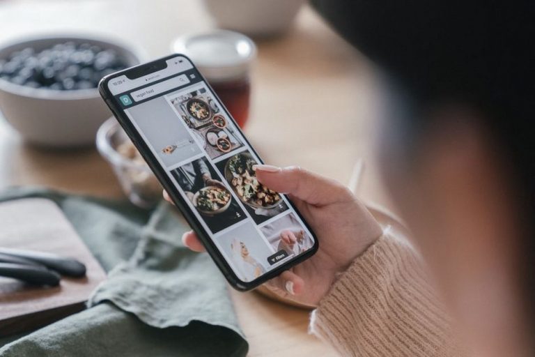
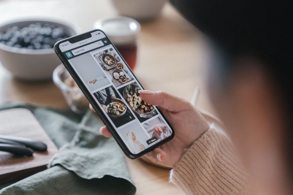
Try following a recipe on your phone with flour-covered hands. If you have to zoom in to read a quantity, scroll through a long introduction to find the method, or close a pop-up before you can start, the page is making dinner harder. A mobile-first approach gets those essentials working on a narrow screen before refining the desktop layout.
On a paleo and digestive-comfort blog, readers may be checking for eggs, looking for an AIP-compatible variation, comparing preparation times, or finding a note on gradual food reintroduction. The smaller layout must not hide the qualifications that help them interpret that information.
Start with the task, not the device
Open a few representative pages on an actual phone: a recipe, an informational post, a category page, and a contact or about page. Try one realistic task on each without zooming. On a recipe, find the ingredients, servings, method, and substitution caveats. On an elimination-diet post, look for what the approach excludes, its limitations, and when professional guidance matters.
Write down where the page gets in the way. Does the menu cover the title? Does an ad push the ingredients several screens down? Is it clear whether “nightshade-free” describes the original recipe or just one variation? Those observations tell you more than a polished mobile screenshot.
Try more than one narrow width, in portrait and landscape orientation. Resizing a browser is useful during development, but a phone exposes missed taps, oversized sticky bars, and text that is hard to read in ordinary lighting. Check again after publishing: a new ad, theme update, or embedded form can change the experience.
Put essential information where readers can reach it
Near the top of a long recipe page, a short overview can cover preparation time, cooking time, servings, key ingredients, and a clearly labeled way to reach the recipe. “Jump to recipe” should take readers to the ingredient list and instructions, not another promotional block. Leave the fuller notes available for anyone who needs them.
Label exclusions precisely. If a paleo recipe contains eggs and nuts, say so instead of calling it broadly “allergy-friendly.” If an AIP variation changes the cooking method or texture, explain that beside the substitution. Recipe filters depend on consistent definitions, too.
Give informational posts the same care. State the main distinction early: a symptom diary, for example, can organize observations but cannot diagnose a food intolerance. Use headings that match readers’ questions and short paragraphs that keep the uncertainty intact. Don’t tuck important cautions into a collapsed panel readers may never open.
Give each page one clear route forward
Use familiar labels in a compact mobile menu, such as Recipes, Paleo Basics, Digestive Comfort, and About. If you cover both exclusion and reintroduction, consider separate destinations; someone looking for reintroduction guidance should not mistake elimination advice for a complete plan. Search helps, but it cannot make up for confusing categories.
Keep titles descriptive in menus and search results. “Egg-Free Salmon Patties” tells readers more than “Easy Weeknight Favorite.” On the page, separate the original recipe from optional changes so no one assumes every version meets the same dietary criteria. For persistent symptoms or significant dietary changes, clearly advise readers to talk with a doctor rather than use the page to diagnose a condition or replace care.
Make reading and tapping comfortable
Mobile-first does not mean shrinking the desktop page. Text needs to be readable at a normal viewing distance, with enough contrast against the background. Let lines wrap instead of forcing sideways scrolling. Break up long ingredient notes, but keep each measurement with its ingredient.
Space links, menu items, checkboxes, and buttons so a tap reaches the right one. Serving adjustments, unit conversions, and print options can be particularly fiddly when they sit close together. Test with a thumb rather than a mouse pointer. A sticky bar may help, but it should leave room for the article and must not cover a section after someone taps an in-page link.
Check forms separately. A newsletter signup needs a visible email-field label, a keyboard suited to entering an address, and an error message people can understand. Readers should not have to dismiss a signup prompt to see the first paragraph. If it keeps reappearing during the same visit, it becomes an obstacle.
Check the details that screen readers and keyboards use
Put headings in a logical order so readers can move through a long post by section. Write links that make sense without the surrounding sentence. Give informative images brief alt text describing what matters; decorative flourishes need not repeat nearby prose. Interactive elements should work with a keyboard and show a visible focus state. These checks help people using assistive technology and can reveal confusing page structure for everyone else.
Keep pages light without removing useful context
Large food photos can delay the ingredient list. Size images for the space they actually occupy, use a suitable compressed format, and provide smaller versions for narrow screens. Photos farther down can load as readers approach them. The main image and opening text should not have to wait for a long chain of scripts.
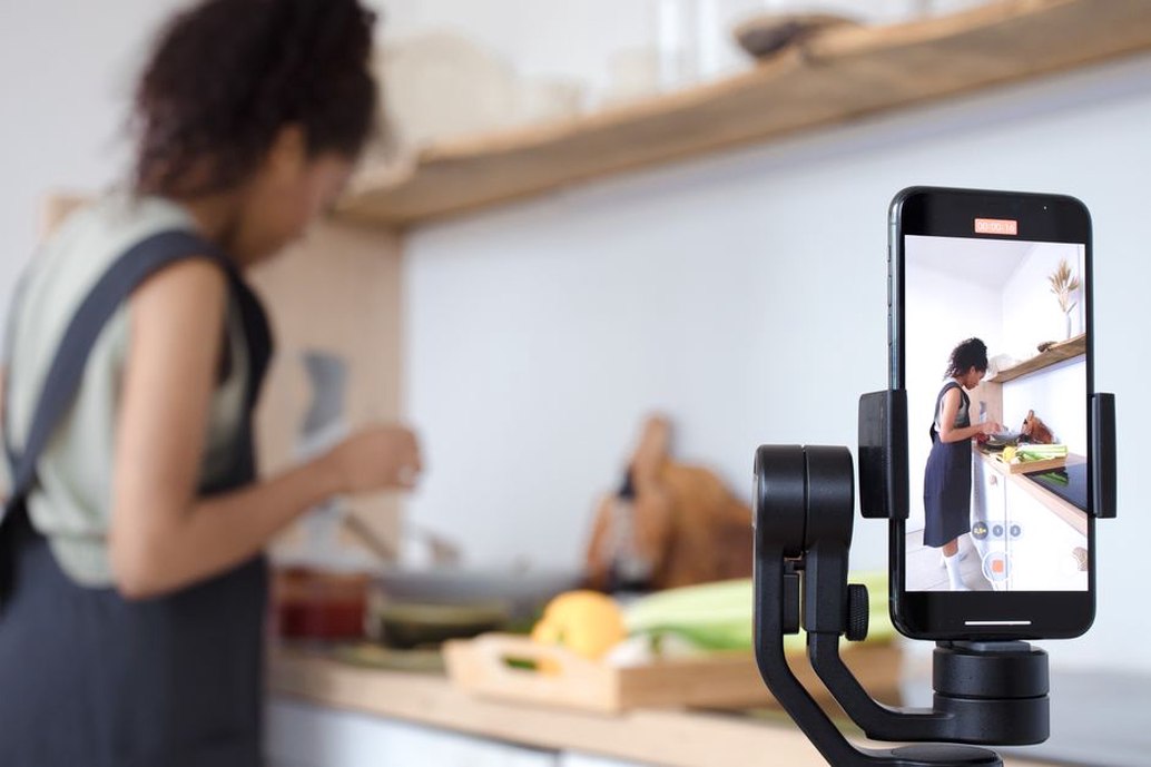
Look at everything else the page loads: fonts, social-sharing widgets, videos, analytics, ads, and pop-up tools. Each may have a purpose, but together they can slow reading or shift a button just as someone goes to tap it. Reserve space for images and embeds so step three of a recipe stays put while the page loads.
Don’t speed up a nutrition post by deleting the context that makes it responsible. A note that paleo eating is not medical treatment, or that an elimination diet can be restrictive, matters more than a decorative animation. Cut avoidable technical weight first.
Test the pages readers actually use
Make the mobile audit a short checklist you can repeat, rather than a one-off redesign. Test different page types and record both the problem and the task the reader was trying to finish:
- Recipe: Can someone find ingredients, adjust servings if that option exists, and follow the method without sideways scrolling?
- Diet guidance: Are exclusions, nutritional considerations, limitations, and the role of medical advice easy to find?
- Search and categories: Does “egg-free” return properly labeled recipes rather than loosely related posts?
- Navigation: Can someone return to a list without losing their place or facing an overlay?
- Slow connection: Can they use the core text while nonessential media loads?
Ask someone who doesn’t know the site to complete a task without coaching. “Find a lunch recipe without eggs, then tell me whether its suggested variation uses nuts” reveals more than “Does this page look good?” Notice where they pause and whether wording, layout, or categorization is responsible. One person’s experience is not universal, but they may catch a problem you’ve learned to work around.
If you use analytics, interpret mobile and desktop differences carefully. Lower mobile engagement might point to a slow page; it might also mean someone found the cooking time and left satisfied. Pair the numbers with task tests, search terms, and specific feedback. A single metric cannot show whether readers understood health-related information.
Keep dietary information accurate across small-screen features
Mobile layouts often shorten labels or hide secondary text. That is a problem when the missing words change a food claim. Don’t mark a recipe card “AIP” if only a separate modification follows that protocol. And “dairy-free” does not mean a dish is suitable for everyone with a food allergy; ingredients, cross-contact, and individual needs still matter.
Compare recipe cards, search snippets, printable versions, and full pages. When an ingredient changes, update the tags and substitution notes as well. If a post covers a structured elimination phase, distinguish it from long-term eating and explain that reintroduction calls for attention to nutritional adequacy and personal circumstances. Anyone with persistent digestive symptoms or considering substantial dietary changes should discuss them with a doctor. A website cannot determine what is causing symptoms.
For your next maintenance pass, choose one recipe and use a phone to time the route from its search result to the first cooking instruction. Note every tap and interruption. If an egg-free note appears only after that instruction, move it beside the ingredients and try the route again.