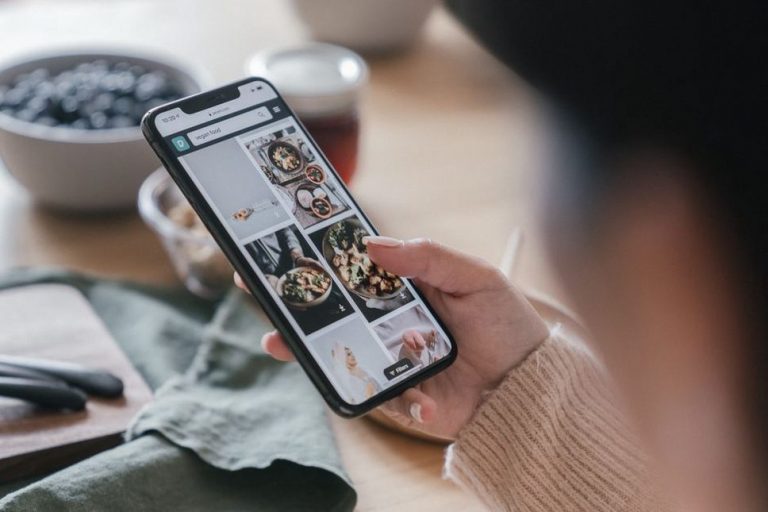
A reader might find your paleo breakfast recipe through search, save a meal-planning graphic, then open your newsletter three weeks later. A familiar name, visual style, and approach to explaining food choices help them connect those encounters. If each one looks and sounds unrelated, they have to work harder to tell they came from the same blog.
Consistent branding means using recognizable cues wherever a publication appears. That includes its name and logo, but also its headlines, photography, page layout, and approach to health claims. Readers often find a useful nutrition post before they notice who published it. Familiar cues can help them find the source again; they do not, on their own, prove its advice is sound.
What readers are actually recognizing
A brand is more than a set of matching colors. It is the pattern readers pick up over time. A restrained recipe-card design may catch their eye, while a headline that names the ingredients instead of promising to “heal your gut” tells them something about the publication’s judgment.
For a paleo and digestive-comfort blog, that pattern might include clear ingredient notes, practical substitutions, and a distinction between personal experience and evidence. Someone moving from a social post to the full recipe should find the same dish name, the same essential ingredients, and the same caution around health claims. Otherwise, the click can feel like a bait and switch.
Recognition builds over repeated encounters, and it is not quite the same as recall. Someone may recognize a recipe-card design in their feed without being able to name the blog from memory. Steady cues help when each encounter lasts only a few seconds.
Keep the source name easy to identify
Use one primary publication name wherever there is room: on the site, in newsletter headers, on social profiles, and on graphics meant to be shared. A platform’s character limit may force a different handle, but the visible name should make the connection clear. If the newsletter has its own title, say which blog sends it.
Choose a compact logo or wordmark that stays legible on a phone. Fine lines and tiny taglines often vanish in a profile icon. Put the full publication name in the profile description and on the linked page, where readers can check who is speaking.
Make visual choices repeatable
A limited palette, readable type hierarchy, and consistent approach to images can make different posts feel related. That does not mean every photo needs the same subject or every graphic the same template. Food should look clear and appetizing in a recipe image; an explainer on elimination diets might be better served by a simple diagram.
Settle a few production decisions: where the publication name sits on a graphic, how large headings appear, and whether ingredient labels match the wording in the post. Those choices are more useful day to day than an elaborate style guide nobody can follow.
Editorial consistency is part of the brand
Returning readers need more than familiar colors. They need to know how to interpret what they find. If one post explains that bloating has several possible causes and the next promises that one food swap will resolve it, the blog sends mixed signals, even if the pages look identical.
A steady editorial approach can set useful expectations:
- Define terms. Say whether “paleo” describes a recipe’s ingredients or a broader eating pattern; readers may use the label differently.
- Describe limits. Separate what evidence suggests from what someone might notice after changing their meals.
- Keep recipes usable. Show ingredients and relevant variations plainly, without burying them under a dramatic headline.
- Use a steady tone. Leave room for experimentation without suggesting readers have failed when a food does not suit them.
- Handle uncertainty consistently. Do not present an untested possibility about food sensitivity as a diagnosis.
Over time, readers may recognize the publication by its judgment as much as its design. Consistency does not replace source review or corrections, though. It helps make those habits visible.
Carry one identity across different formats
Someone looking for an AIP meal idea might first see a short caption, then open a detailed recipe, then read an email about meal planning. Each format has a job. The caption can name the dish and its key dietary constraint; the recipe can provide ingredients and instructions; the email can explain how it fits into a week of cooking. None should make a conflicting claim about what the meal can do.
Start with a few repeatable elements rather than trying to standardize every sentence. A working guide might include the publication name, logo files, colors, fonts, image preferences, preferred food terms, and claims the blog avoids. Add examples of a recipe title, an explanatory headline, and a newsletter subject line. Those give contributors more to work with than “sound trustworthy.”
Templates should leave room for the content. A recipe graphic can reserve space for the dish name and site name while allowing the food photo to determine the crop. An educational graphic can use the same type and colors but devote more space to a definition. If important details end up in tiny text, change the template.
Check the handoff between channels
The page someone reaches matters as much as the post that sent them there. A graphic labeled “ginger chicken soup” should lead to a page that uses that name prominently and shows a recognizable version of the dish. If an email promises a guide to gradual food reintroduction, it should not land on a generic list of foods to avoid. The two pieces need to agree on what readers will find.
Check those handoffs on a phone. Is the publication name visible? Are headings readable? Has a platform preview cropped important text? In nutrition content, losing a word such as “optional” can change how an ingredient note reads.
Keep health guidance consistent without making every page identical
A weeknight recipe can be direct and encouraging. A discussion of elimination diets needs more space for limits and safety. Both can reflect the same commitments: plain language, realistic expectations, and respect for individual circumstances.
An AIP recipe, for example, can describe its ingredients without implying that the protocol treats an autoimmune condition. A food-sensitivity article can help readers organize observations without treating a symptom diary as a diagnostic test. Readers should discuss persistent symptoms and dietary changes, including extended elimination, with a doctor. An exclusion diet is not a substitute for medical care.
These boundaries shape the brand as well as protect readers. If the blog usually explains what dietary changes can and cannot tell someone, a headline that drops those limits may win a click but undermine the expectations built by earlier posts.
Where consistency can go wrong
Uniformity can get in the way. A rigid color treatment might make food look unappealing; a fixed headline formula might hide what an article is actually about. The point of a brand system is to help people identify and use the content, not to make every item look interchangeable.
Polished design is not evidence of expertise, either. Familiar presentation can make a poorly supported claim feel credible. Give readers better ways to assess the material: clear authorship, dates where relevant, explanations of uncertainty, and corrections when something changes. A repeated badge or slogan cannot do that work.
Different formats also need different layouts. A square social graphic, a long recipe page, and an email do not have to match exactly. Keep the source name, editorial voice, and description accurate while adapting to the space. Readable contrast and descriptive image text matter more than preserving an exact shade or squeezing everything into a crowded design.
Build a small, usable consistency check
You do not need to audit the whole site at once. Choose a recent recipe, an evidence-focused explainer, a newsletter issue, and the social posts linking to them. Look at each on a phone and a desktop screen, then ask:
- Is the publication name visible and spelled the same way?
- Can someone tell which post or recipe a shared graphic leads to?
- Do headlines, captions, and destination pages agree on the main point?
- Are recurring design choices recognizable without hurting readability?
- Are health claims and caveats held to the same standard across formats?
- Can readers identify the author or publisher of each page?
Fix what most affects understanding first. A misleading caption matters more than a slightly different button color. If several people contribute to the blog, add each fix to the working guide so the next person does not have to guess.
To judge whether the changes help, look for patterns rather than treating one metric as proof. Returning readers, subscribers who recognize the publication name, or people who reach a full recipe after seeing its graphic may offer useful signals. Traffic shifts have many causes; a new palette or template alone cannot explain them. Asking readers where they first encountered the blog may tell you more about how they move between channels.
Before scheduling your next piece, put its social preview, newsletter mention, and destination page side by side. Check that all three name the same subject, then shrink the preview to phone size. Can you still read the publication name—and does the click lead where the preview says it will?