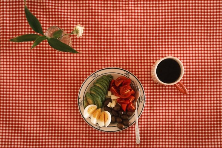
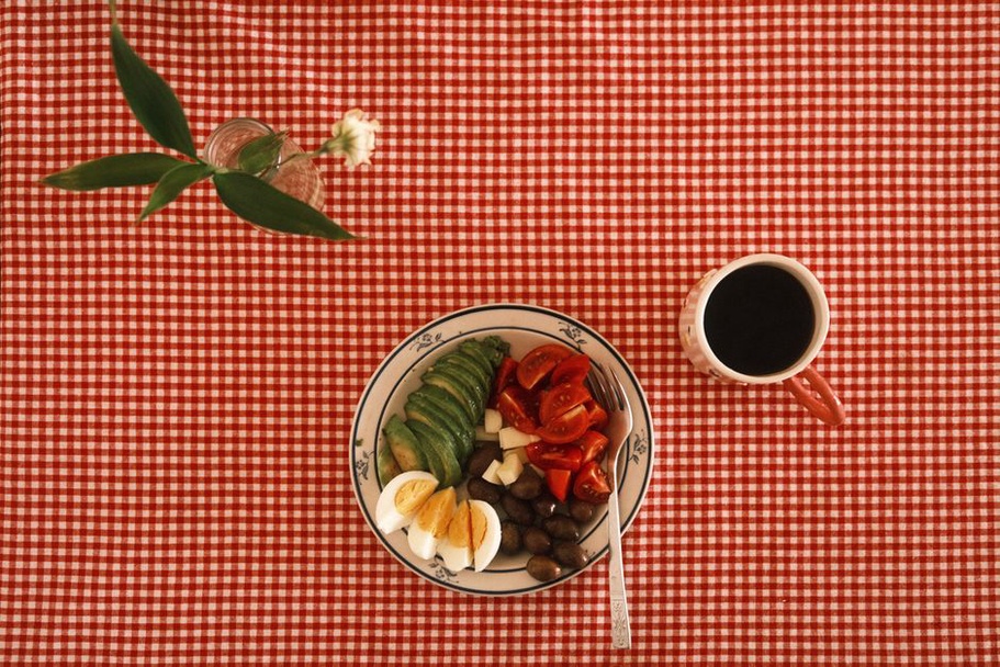
A finished-dinner photo cannot tell a reader whether the sauce contains an excluded ingredient or whether that garnish went on after cooking. If someone is checking a recipe against their current food list, an overhead shot of the ingredients beside the plate may help more than a styled serving photo. Show the detail that helps them decide what to cook or check, not just what looks appealing.
You do not need a studio, paid design software, or a fresh photograph for every post. A phone camera, daylight, readable labels, and a consistent layout can serve recipes, shopping guides, and posts about paleo or autoimmune protocol (AIP) eating. Be clear about what the visuals cannot do: a photograph cannot establish that food is safe for someone with an allergy, and a diagram cannot diagnose the cause of bloating.
Start with one reader task
Before making a graphic, write down what the reader needs to do with it. “Understand the post” is too broad. “Find the step where the vegetables go into the pan” or “see which ingredients to check on a packaged sauce” gives you a useful brief. If no task comes to mind, a clear paragraph may work better than an image.
In this subject area, a visual might help someone:
- Recognize recipe ingredients before shopping.
- See the texture or size of food at a cooking step.
- Compare a meal idea with their current list of included foods.
- Follow the order of a food-and-symptom diary entry.
- Understand that elimination and reintroduction phases have different purposes.
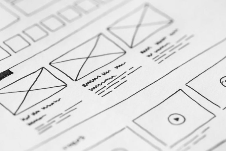
Choose the format once you know the task. Use a photograph for appearance, portion context, or technique; a short diagram for sequence; and a table when exact wording or comparisons matter. A decorative collage does little to help someone check ingredients. A photo of a notebook is likewise less useful than a readable example of what to record.
Build a useful photo setup from what you have
Let the food provide the detail
Put a plate or cutting board near a window. If overhead lights give the food a competing color cast, switch them off. A plain towel or neutral cardboard can quiet a busy background. Wipe the phone’s camera lens, steady the phone, and take a few frames before moving the food. Those small adjustments often do more for clarity than elaborate styling.
Photograph the thing the reader needs to identify. For soup, a close view can show texture while a wider one shows the vegetables, protein, and serving bowl. If a recipe calls for finely chopped greens, photograph them before cooking; the finished dish may not show what “finely chopped” means. Keep raw and cooked ingredients visually distinct so the process is easy to follow.
Take the practical shot before adding any styling. Herbs, seeds, sauces, and spice blends may not fit a particular elimination phase or an individual’s needs. If a garnish appears in the photo but not the recipe, readers must guess whether to use it. List it accurately, mark it optional where appropriate, or leave it out of the shot.
Plan a small set of shots, not a large gallery
Most recipes need no more than three useful views: key ingredients, a step that benefits from a visual cue, and the finished food. Pick a step that words might leave open to interpretation, such as sauce thickness or the size of chopped vegetables. If every step is clear in text, skip the extra photo.
For packaged-food posts, an old label photo is not proof of current ingredients. Formulas can differ by brand or market and change over time. A cropped, readable example can show where to look, but tell readers to check the package in their hands. Keep allergy-related cautions in the written content as well as near the image.
Turn complex ideas into modest diagrams
Some topics need structure rather than photography. A reintroduction diagram, for example, could show broad stages: discuss the approach with a clinician, note what is currently being eaten, introduce one planned food, record observations, and review them before deciding what to try next. It should explain the logic, not prescribe a schedule for everyone or suggest that symptoms identify a disease.
Use simple shapes, a few colors, and short labels. You can sketch the flow on paper, then rebuild it in basic presentation software. Open the result on a phone: if the reader needs tiny text or several colored arrows to follow it, simplify it. Number steps when order matters so color is not the only cue.
Leave room for uncertainty in diagrams about digestive discomfort. An arrow straight from “food” to “bloating” suggests a proven cause, although meal size, timing, and factors unrelated to a single ingredient may also matter. Separate observation from interpretation instead: “what I ate,” “what I noticed,” and “questions to discuss.” Persistent symptoms and substantial diet changes belong in a conversation with a doctor, not a graphic or a self-diagnosis.
Keep comparisons honest
Before-and-after pictures can turn differences in lighting or plating into apparent health outcomes. Do not use them to imply that a diet resolved inflammation, an autoimmune condition, or gut symptoms. An icon labeled “gut health” next to a food does not establish a benefit either. If the claim needs qualification in the article, the graphic needs it too.
Compare things a picture can actually show: two ways to pack a meal, different vegetable cuts, or examples of information found on ingredient labels. Say what is being compared without suggesting one option suits everyone. Food tolerances and dietary requirements differ.
Make templates for recurring reader questions
A small set of reusable formats can save time without making every post look the same. Make a template when you repeatedly present the same kind of information. A recipe ingredient panel, for instance, could hold the dish name, main components, and a note about optional ingredients. A diary example could have columns for time, food and drink, amount as the person describes it, symptoms, and other relevant context.
Keep each entry readable on a phone. Export an example and open it without zooming. If labels disappear, remove content instead of shrinking the type again. Put detailed explanations in the article, where readers can enlarge text or use assistive technology more easily.
Be especially careful with “suitable for” badges. AIP approaches vary by phase, and a paleo label says nothing about allergies, personal tolerances, or every ingredient in a dish. A badge may sound more certain than the information warrants. A plain ingredient list with clearly marked optional substitutions usually tells readers more.
Write for people who cannot use the picture
Give useful visuals a text equivalent. Alt text should describe what the image contributes, not repeat a filename or say “food photo.” For an overhead recipe shot, “Roasted squash and chicken served with cooked greens” may be enough. If a photo illustrates a step, name the important state: “Vegetables cut into small, even pieces before roasting.” Do not put an interpretation in alt text that the image cannot support.
If a diagram carries instructions or distinctions, a brief image description is not enough. Put the main sequence or comparison in nearby prose or an HTML list. Someone using a screen reader should be able to get the essential information without working through a long string of labels. Never put a recipe’s only ingredient list inside a graphic.
Check text contrast, and do not rely on red and green alone to mean “include” and “exclude.” Add words or clearly labeled symbols. Captions can identify an optional ingredient or explain that a packaged label is only an example. Do not hide an important safety limitation in tiny caption text.
Use low-cost assets without losing accuracy
Your own photos of recipe tests are often the most direct choice. If you use a free image library, check the license for that asset and note where it came from. Do not assume a similar-looking dish contains your recipe’s ingredients: the sauce in a stock photo might contain dairy, soy, or something else your version omits. Generic images can set a mood, but they cannot represent a tested result or a particular packaged product.
Before reusing one of your own images, check it against the current text. An older plate photo may show a garnish removed from the recipe; a shopping diagram may use an ingredient category you now describe more carefully. Keep a clean original file so small corrections do not mean rebuilding the design.
Use filenames you can recognize later, such as “chopped-carrots-before-roasting” rather than “final-v3.” Separate originals from web-ready files to reduce the chance of uploading a blurry draft. Date packaged-label photos so no one mistakes them for a current example that applies everywhere.
Edit for speed and for accuracy
Crop around the detail that answers the reader’s question. Fix an obvious color cast if the food looks unlike it did in person, but avoid filters that misrepresent doneness, browning, or texture. Export an image sized for its place on the page, then make sure any labels are still readable. A huge file can slow a recipe page without improving a small on-screen photo.
Before publishing, open the page on a phone. Can you see the important detail without zooming? Does the image match the recipe or explanation? Can someone who cannot view it still get the necessary information? Those checks matter more than perfect shadows or a trendier font.
Give exclusion-focused content one last look for visible ingredients missing from the text, arrows that overstate what symptoms mean, and labels that might read as medical advice. Restrictive eating is not a substitute for medical care. Recommend that readers discuss persistent symptoms and dietary changes with a doctor.
A practical visual brief for one post
Say you are preparing a post about a make-ahead lunch. Start with one sentence: “The reader needs to see what goes into the container and which component is packed separately.” Take an overhead photo of the unpacked components, then one of the packed container. Identify the separate sauce in the caption and list its ingredients in the recipe. Photograph a substitution only if seeing the difference would help; otherwise, describe it in words.
During the final edit, remove any decorative ingredient that is not in the recipe. Check the page on a phone after cropping: if the separate container is no longer visible, the second photo has lost its purpose.